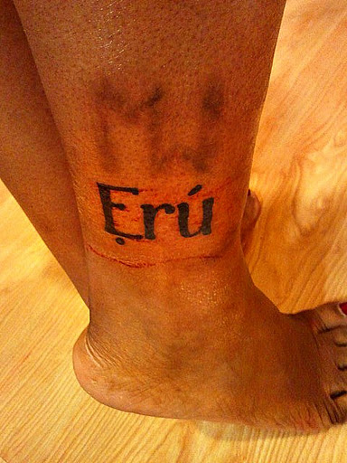
Ẹrú.
I think about tattoos for at least a year before getting them. I’ve wanted an affirmation of my identity as a slave for some time now. But its me, so I gotta be different. I’ve seen people with BDSM logos, with their Slave Registry numbers, with their owner’s name, with various Japanese and Chinese characters describing their submissive or slave status…and while I see the appeal…yeah. I gotta be me.
I considered my history of struggle with even using the term “slave” as a descendant of African slaves. My branding, which represents my initials flowing together,  is a personal acknowledgement to those who went before. While I can never ever know what they lived, I can carry with me a marker of my honoring the ancestors, bowing to the past.
I did some research, did some meditating, and decided that I would continue in that line and manifest my identity in a note to myself that I can see and carry.

Ẹrú is the word for slave in Yoruba.
See, it is sometimes difficult for me to accept things. Took me a few years to accept being kinky, a few more to accept being a slave, and even more pain and time to embrace the fact that my kink also encompasses my racial background. I though to myself, well, the answer is obvious then. Remind yourself of who you are now by remembering where you came from.
Identifying as a slave isn’t something that came easy. Lots of people want you to only ID as such if you are actively owned. Took me years…no shit…to realize that I am who I am regardless. That is My belief. Color is an illusion of light, yes, scientifically. But i don’t stop being black when the lights go out.
I will carry this as a nod to those who did not have the freedom of choice that I enjoy.  I will carry this to remind myself that being  a slave, and finding fulfilment in that identity is not dependent on anyone else. It is who I am, it is a source of my vulnerability, and a source of my power.
Ẹrú, in my heart and spirit and blood. And I am proud.

I loved reading this. It made me smile. It looks beautiful on you!
Thank you Vanille! :-D And thanks for reading!
Peace
~Mo
You are such an amazing person and I always feel better for having heard you speak or read your words. You were one of the first blogs I found (and enjoyed/agreed with) when venturing out into kink so I’ve got a special starcrush on you :P
I think it’s a beautiful well thought out tattoo and looks great on you.
Hi Ellen!
Thanks for your comment…that really made my night :-D
Now I’m all blushy and stuff…
I’m a font nerd and I’m trying to figure out which typeface you picked… serif for the win! Gorgeous.
I’d love to hear the story of your MW brand at some point, if you’re willing to share…
Hi Carrie!
The font is called “The World Is Yours” and MÃ¥ns Grebäck is the creator. http://www.mawns.com/wordpress/font/?font=the-world-is-yours
The brand was done by Fakir Musafar. I was selected to receive it as part of a demo on ritual branding. I wanted it as a sign of self-ownership, as a nod to the previous non-consensual deviation from the body modification of ritual scarring and branding that is a tradition all over the world. Part of it was my claiming it for myself, and shedding the notion that I need to have someone else’s permission to manifest who I am.
It was done with multiple short strikes from a bit of surgical steel, 10 strikes originally planned but it wound up being 11, because one strike was a bit thin, initially.
It was AGONIZING in the healing process…and the Ẹrú mark is proving a slow healer, too. The ankle is a rough fuckin’ spot to get friggin burned or scraped into your flesh!
Peace
~Mo
Best. Font name. EVER.
Not a lot of padding on the ankle, right? Thanks for sharing — I was wondering if you’d had the MW symbol designed in metal or something, but now I can see how it adds up to 10 lines. VERY cool. And, very brave.